Details
-
Improvement
-
Resolution: Fixed
-
 Medium
-
None
-
None
-
None
Description
There are some improvements / fixes needed in focused overlays
1) Position of the action buttons in toolbar: in normal stand buttons should be aligned to the right edge of the toolbar, in collapsed version - occupy the center of the second line.
2) Minimal width of the focus overlay is 320px (phone portrait)
3) Please, take care about the fonts / typografie: compare the labels in Photoshop sketches and the resulting HTML rendering - there are seriou differences in font weights as well as in vertical centering. Different browsers render differently, therefore we'll need some UA-based enhancements here to assure the best quality.
4) Please, control the heights and spaces between lines of toolbar in "small" stand, currently it's too big - see the PS for reference
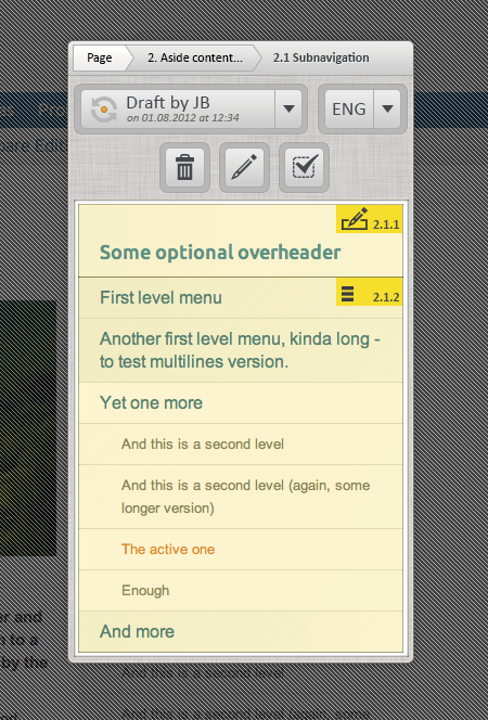
5) Add "list" icon to the marker for list items
6) Care also about vertical alignement of the "saving status marker" in drop-down.
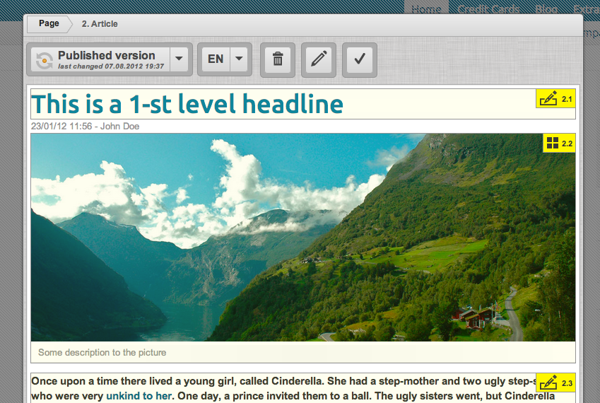
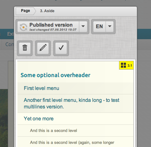
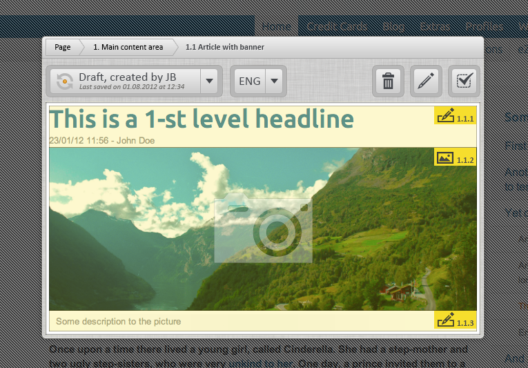
7) Please, highlight "Page" segment of the breadcrumb (everywhere), because it works slightly different, then the other elements and is, probably, the most important control. I want to have it more "outstanding"
8) Can we somehow assure, that the there will be at least 3 segments of the breadcrumb always visible: the "page" (as the possibility to get back to start), "the direct parent" (as the possibility to get at 1 level up) and the current selection. If there are other segments in between and we don't have enough space, we can collapse them to 5-6px width pointers.
9) Please make the "disabled" grid look darker, as on the screenshots
10) Colors of the target overlays are OK, leave them as now in prototype
Use 1280x1000_focused_overlay.psd and 1280x1000_small_focus_overlay.psd for reference.